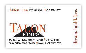
 Your business card is often your first impression with a prospective client. You want it be memorable, stand out in a stack of other business cards, and communicate the barest of essentials. Who you are and how to reach you. Any one can use a free service done by a printer, but you won't likely get that edge you need. Contact us to ensure you capture that edge. Don't forget to ask us about letterhead and envelopes designed to match!
More information about Business Cards
Elements of an Effective Business Card
A business card is fairly simple, and laregly because of its (usual) size there's only so much you can do. So what do you with such precious real estate?
- Keep it simple. At its most basic a card just needs to tell some one what company you are with, what your name is, what your title is, and how to reach you. Consider how likely it is some one will need to fax you. Could that information be saved for your web site? Leave it off if you can. Space is at a premium.
- Horizontal vs. Vertical. The decision is yours (or yours and your designers). The standard is horizontal because it provides the most space, allowing for things like long web site addresses and long names. Vertical however, because it is used less will let your card stand out.
- Front and back? With services by online printing companies making printing cards front and back affordable using a card with 2 sides does allow you to provide additional information, such as a slogan or brief list of services. Possibly even call attention to something that makes you unique, such as donating proceeds to a charity. Just make sure you cluster your contact information on one side rather than splitting it between both sides.
- Font Size. Never below 9 point. You'll be tempted, but anything below 9 point becomes illegible.
- Font Faces. I know that Papyrus font looks attractive, but if prospective clients can't read your phone number it won't do you any good, so save that for the logo. The fancier the font the harder it is to read at the sizes you'll be using on that business card.
- Text Alignment. Left-aligned text because of it's prolific use in written mediums is the easiest for the eye to read. Try to avoid center-aligned and right-aligned for this reason.
- Emphasize it. Finally, remember to make key items prominent, such as your name, your phone number, and probably your email adderss. Most other information, such as your address, are less often used. Make it easy for that prospect to find the info they need. So bold it, make it bigger, change its color.

 Your business card is often your first impression with a prospective client. You want it be memorable, stand out in a stack of other business cards, and communicate the barest of essentials. Who you are and how to reach you. Any one can use a free service done by a printer, but you won't likely get that edge you need. Contact us to ensure you capture that edge. Don't forget to ask us about letterhead and envelopes designed to match!